
Case study: York Minster
As a resident of York and a huge history fan, York Minster is one of my favourite buildings in the world. I’ve visited many times, including the spectacular sound and light show commemorating the 1984 fire. It was a true honour to help bolster its website as a heritage SEO specialist.
Project brief
To work within the existing website’s framework to:
- Increase pre-booked ticket sales and boost presence through strengthening the content and Search Engine Optimisation (SEO) of specific pages within the Minster’s Visit section.
- Ensure families seeking information are accurately served by the content and SEO.
- Fully utilise the potential of SEO elements within the current website’s coding.
- Deliver a training workshop in SEO and online accessibility, including The Equality Act.
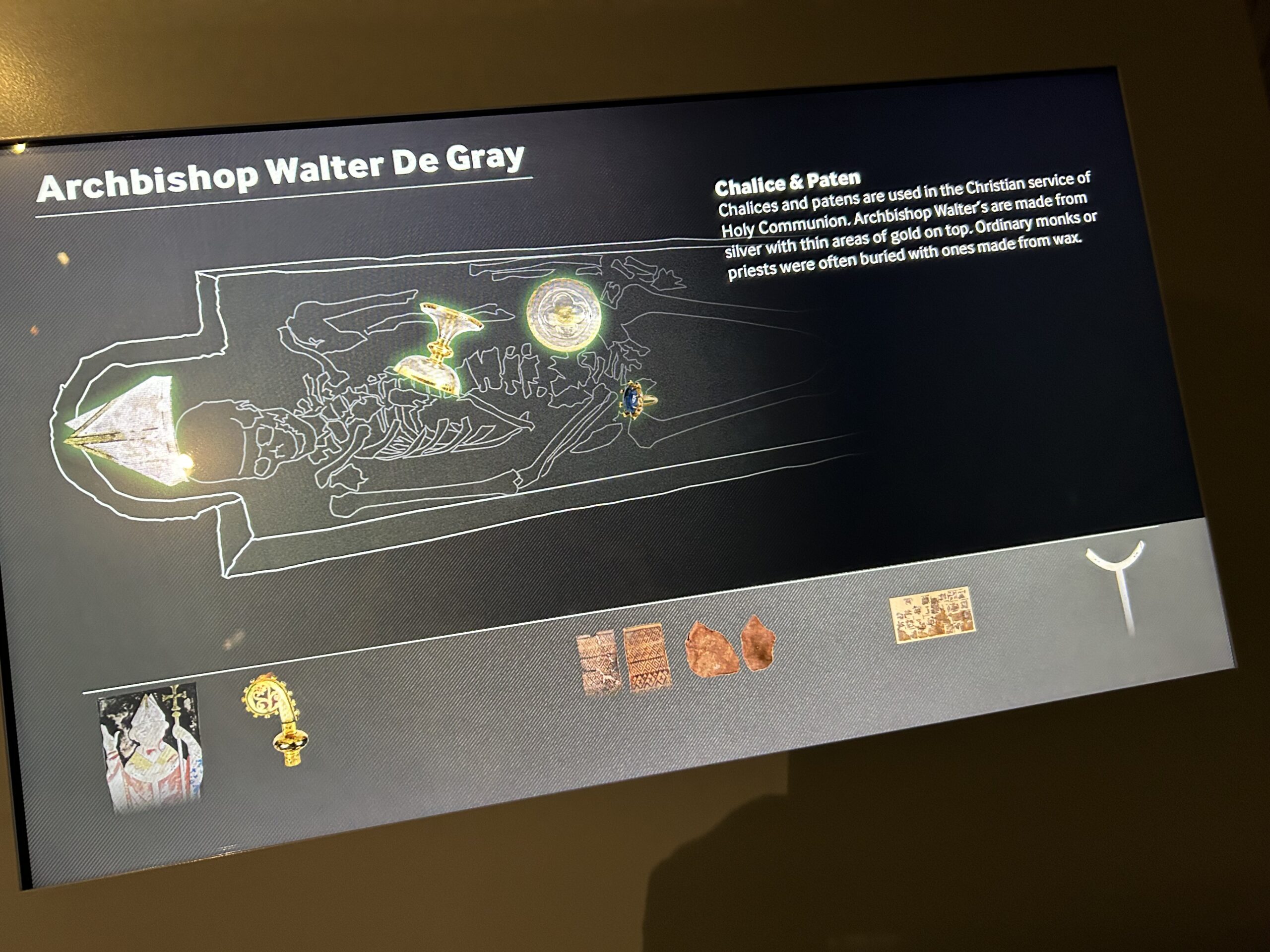
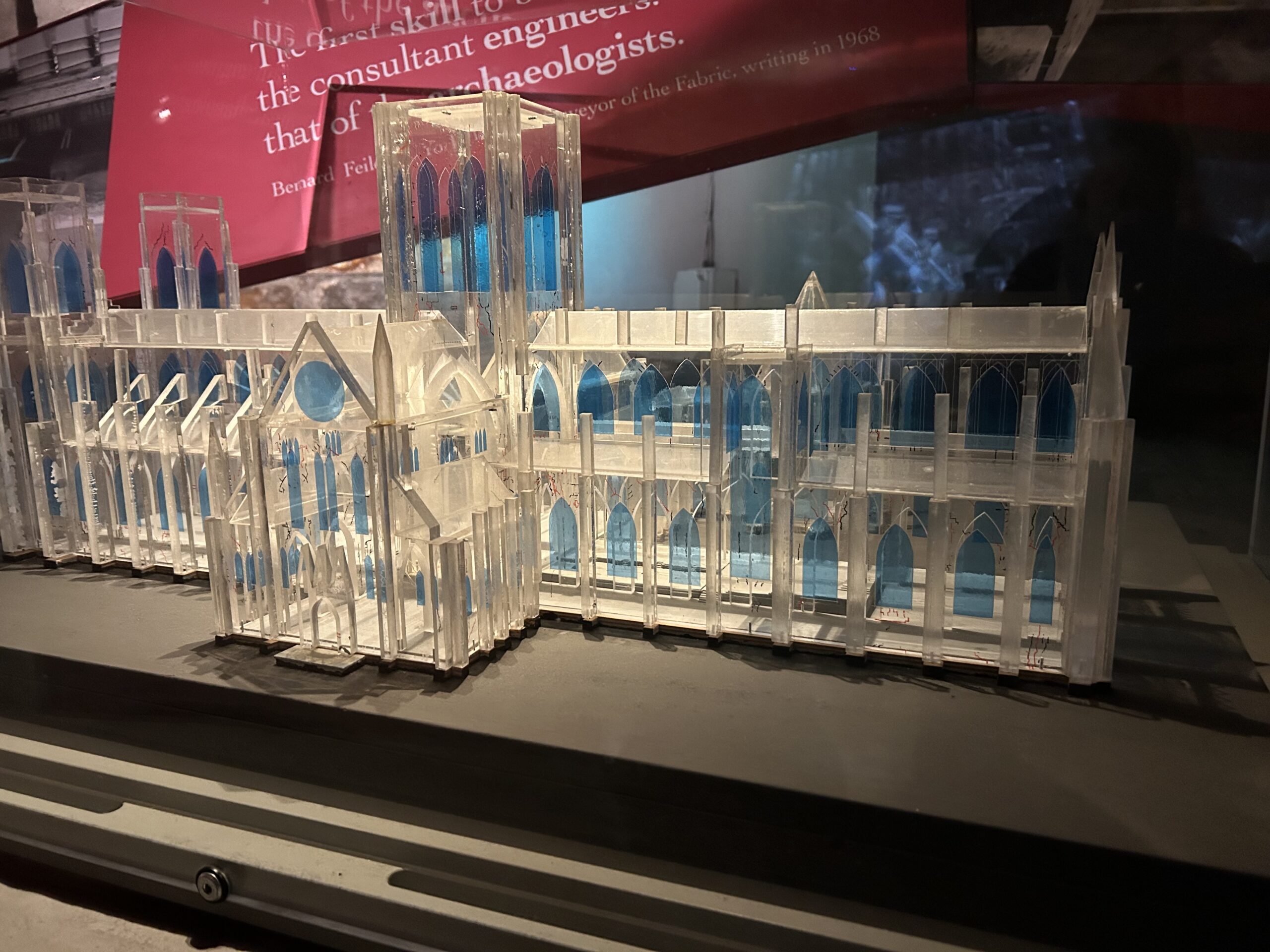
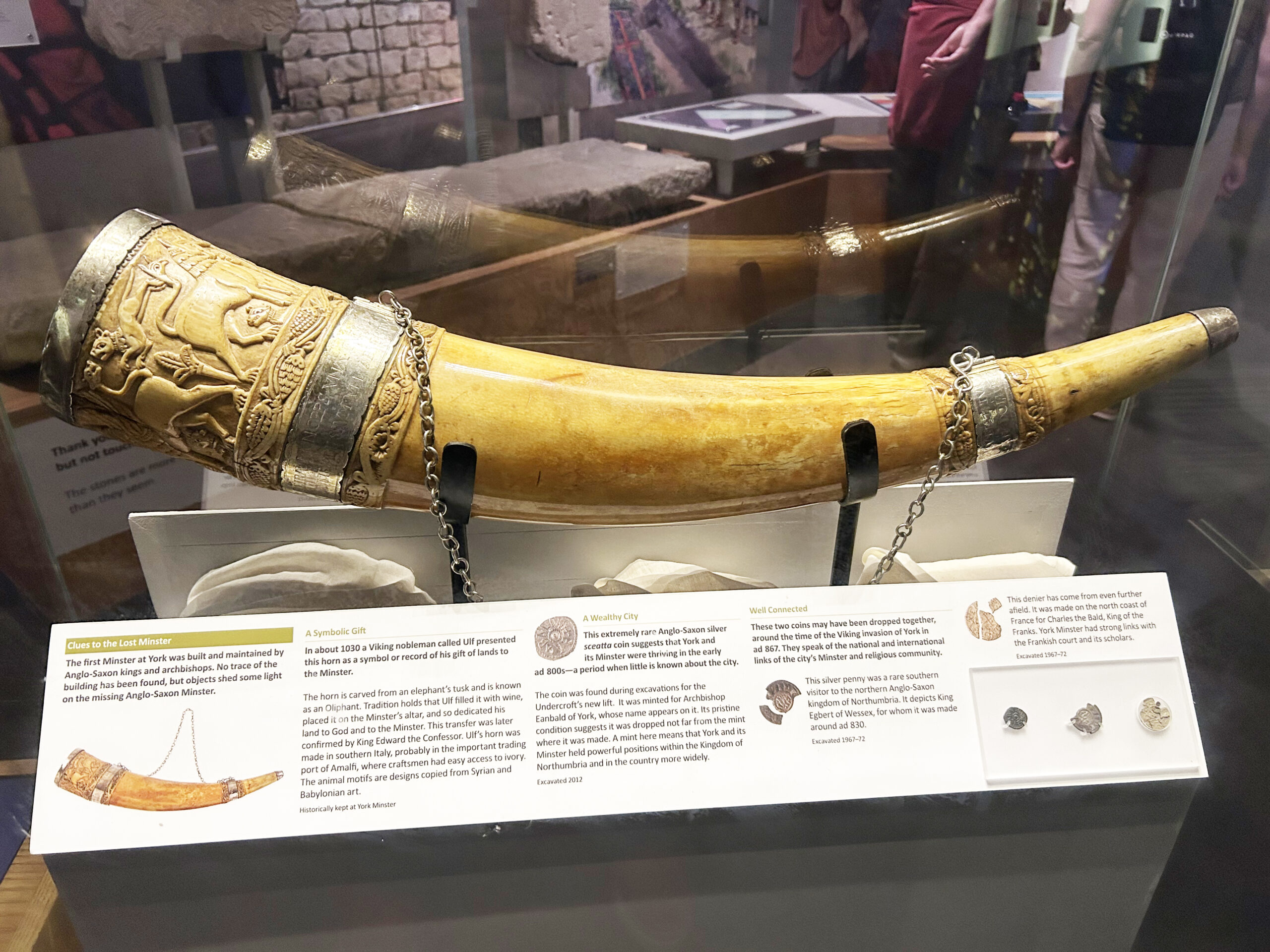
Undercroft Museum gems from my secret shopper visit
Challenges
Unlike other heritage attractions, York Minster is also a place of worship. My past project with Durham Cathedral gave me a lot of experience about how to approach this.
The current York Minster website is several years old, with nearly 2,000 searchable elements. I was asked to assess the menu structure of the entire website for Worship, Visit, Discover, What’s On and About.
English cathedrals don’t receive any regular income from the government or the Church of England. Because of this some, like York, charge entry. However anyone who wishes to worship can enter for free. My task was to make this distinction clear. And underline what a ticket includes.
I was also asked to investigate why, in recent months, there had been an increase in enquiries about a discount last available in 2019.
Solutions
Heritage SEO and website content need to answer what a visitor is looking for. A quick summary would be ‘View, Brew, Loo’, or ‘See, Tea and Wee’, as in:
- What is there to look at or discover?
- Is there a place to have a snack, drink or lunch?
- Are toilet facilities nearby – a key concern of any parent with small children
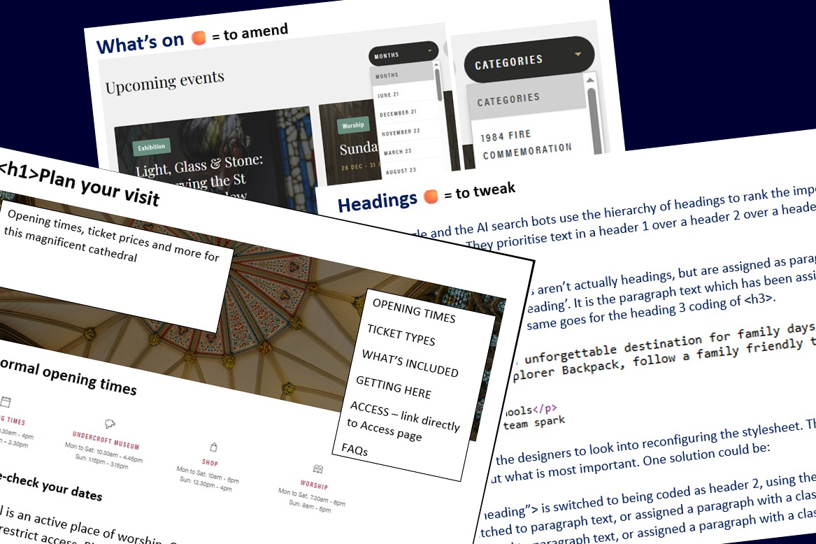
Focusing on the Visit section of the website, I first carried out a website MOT to identify quick wins and fixes. This document is designed to be a To Do list of suggestions to tackle gradually.
I examined each Visit section page holistically. What was its purpose? Did it make sense out of context? I then strengthened it, rearranging the order, and adding new content if necessary. Plus links and ‘hidden’ SEO elements to make the page more attractive to search bots.
A website isn’t a brochure to be read front to back. But rather an information ecosystem which can be internally referenced. The ‘Discover’ section was a rich source of information, such as an interactive map and other treasures. I therefore linked to these from the Visit section.
Really the Minster is two attractions in one. The Undercroft Museum is huge, with Roman ruins, Viking artefacts and brilliant interactive displays. So I made sure to underline how this is included in the ticket price. I also suggested labelling tickets as ‘sightseeing’ rather than ‘general admission’.
The name’s Holmes. Sherlock Holmes…
As for the source of that incorrect discount? AI searches are far less concerned about who is publishing information than traditional Google. Or when it was published. After much detective work, it turned out to be an out-of-date blog.
Over a fortnight, I repeatedly told Google AI mode it was wrong, stating it needed to check the Minster website. ‘Yes, there is a discount’ changed to ‘Maybe’ and then ‘No’. However I also recommended The Minster ask the blog’s authors to update their information.
Results
The York Minster marketing and communications team are working through my recommendations. Some of the changes so far include:
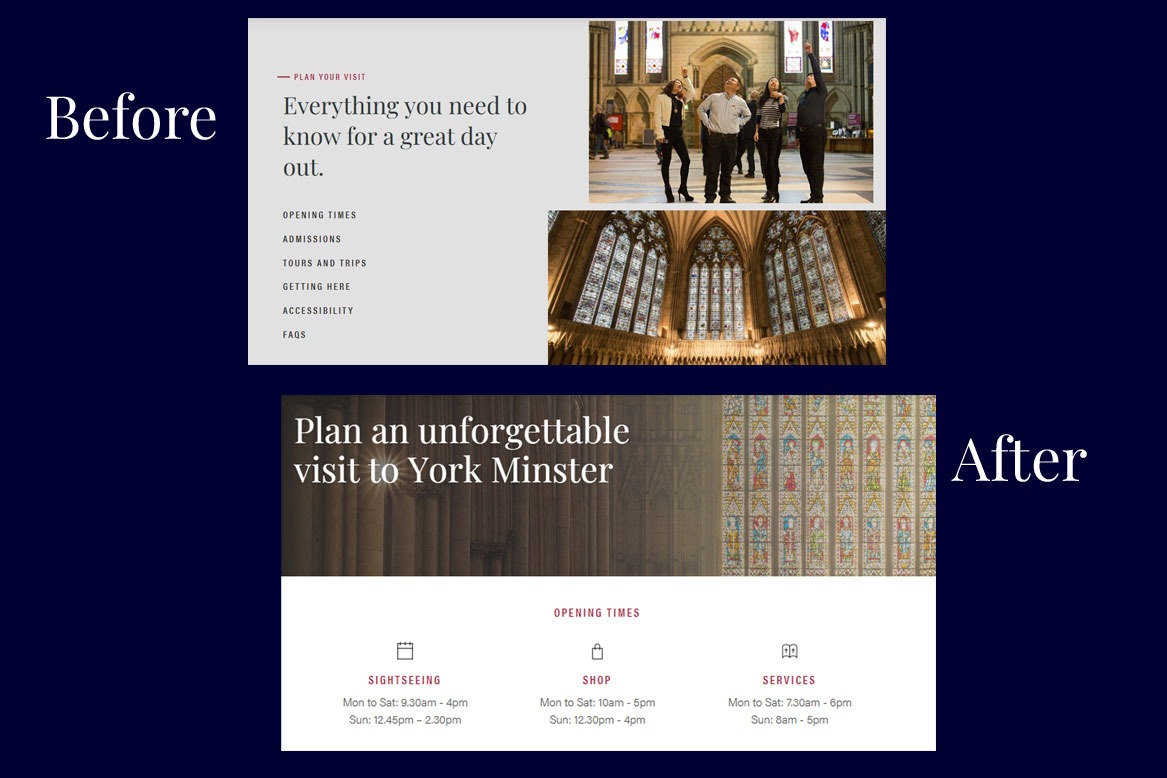
Cut to the chase
My SEO research showed most visitors were trying to find out opening times. So why not present them immediately on the Plan your visit page?
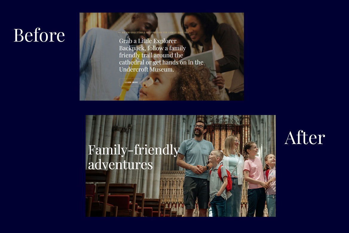
A slimmed-down Family intro
The original text was quite overwhelming to take in. As well as overpowering a mobile phone screen.
I suggested moving this text further down the page. And leading with a punchier headline instead. ‘Family friendly’ is also more likely to be picked up by SEO/AI search.
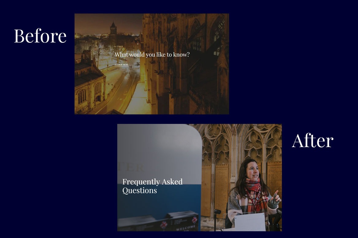
More friendly faces
Much of the imagery on the York Minster website focuses on the architecture, rather than people. This night time image on the FAQs page was at odds with the friendly tone the Minster wanted to convey. It also didn’t represent how most visits happen during the day.
Switching to an inside image with a guide gives a more welcoming impression. The new header makes it obvious what the page addresses.
What my client thinks

Helen’s enthusiasm and care was palpable throughout the process
“Helen performed a variety of services for us, ranging from a MOT of the website to leading a SEO workshop. Helen’s friendliness, enthusiasm and care was palpable throughout the process.
The results have been extremely helpful. Helen’s way of presenting reports has allowed us to easily digest a substantial amount of information to carry forward a number of changes.”
Joseph Priestley, Head of Marketing and Communications, York Minster